STORYTELLING-FIRST DESIGN
Thoughts on storytelling formats, their design structures, and placements.
The last 4~ months have been highly impactful for me. I've moved back to NYC from a 6 month stint on the beaches of San Diego with close friends. We've gone through a pivot at Titles finding ourselves with a wealth of traction in product, fundraising, and momentum. I have newfound happiness derived from getting back to my roots in running, relationships, and self expression. Moreover, it also feels like I am participating in a movement towards societal happiness; we can finally see the end of the light with vaccines rolling out, spring emerging, and the emotional political climate settling.
My co-founder and I have been deep in building mode, talking with users, and learning new things each day. While breathing in the concepts embedded into Titles, crafting new ways to describe our product, and sharing our vision — the combination of these have left me in a reflective place with new thoughts on product building maybe worth sharing ;) Before I get into that, here’s a track you can enjoy while reading.
“STORYTELLING-FIRST DESIGN”
I've seen hundreds of pitches in the consumer and new media space in my life. Often, many of the pitches are centrally focused around things like an emerging technology or a new financial model. I am not here to argue against the value of building these ways. I do think it's more productive to approach building products from a storytelling first perspective. More specifically, what is the format for storytelling you're trying to empower a community with?
Stories come in all shapes and sizes, leverage different narrative engines, and transmit differently within different mediums. It's why each evolution of distribution reopens the conversation around what's possible from a creative perspective. New formats are created, new "creators" are minted, and new business models are wrapped around them. TikTok is the infrastructure for the modern day punchline, Clubhouse is the new meandering talk radio, and it goes on.
While the best platforms come with things like faster sharing and likely have found some distribution hack. It's the builders job to find some non-obvious or overlooked format that works strictly enough for the initial use case to saturate then expand over time. In the early days of these apps, the things posted are extremely literal and cringe, before a culture develops and the meme kicks in. But how do you find those formats? What is the framework for identifying the core of these apps? I think each of them come with two core components:
Specific constraints that define your format.
Constraints are intentional limitations or default states designed into a product that create recurring definitions in the way people use an app. They often seem counterintuitive, play psychological tricks on users, or seem reductive in capabilities.
Examples: 180 character limit, 10 second exploding photos, etc.
Source material that enables creation at consumer scale.
Source material are resources designed into the creation process that add value to the end production or help guide users towards a better creation end state. The recurring theme across all of them is they make all content more compelling, interesting, and expressive.
Examples: Photos as background for texts, filters to make you look hawt, etc.
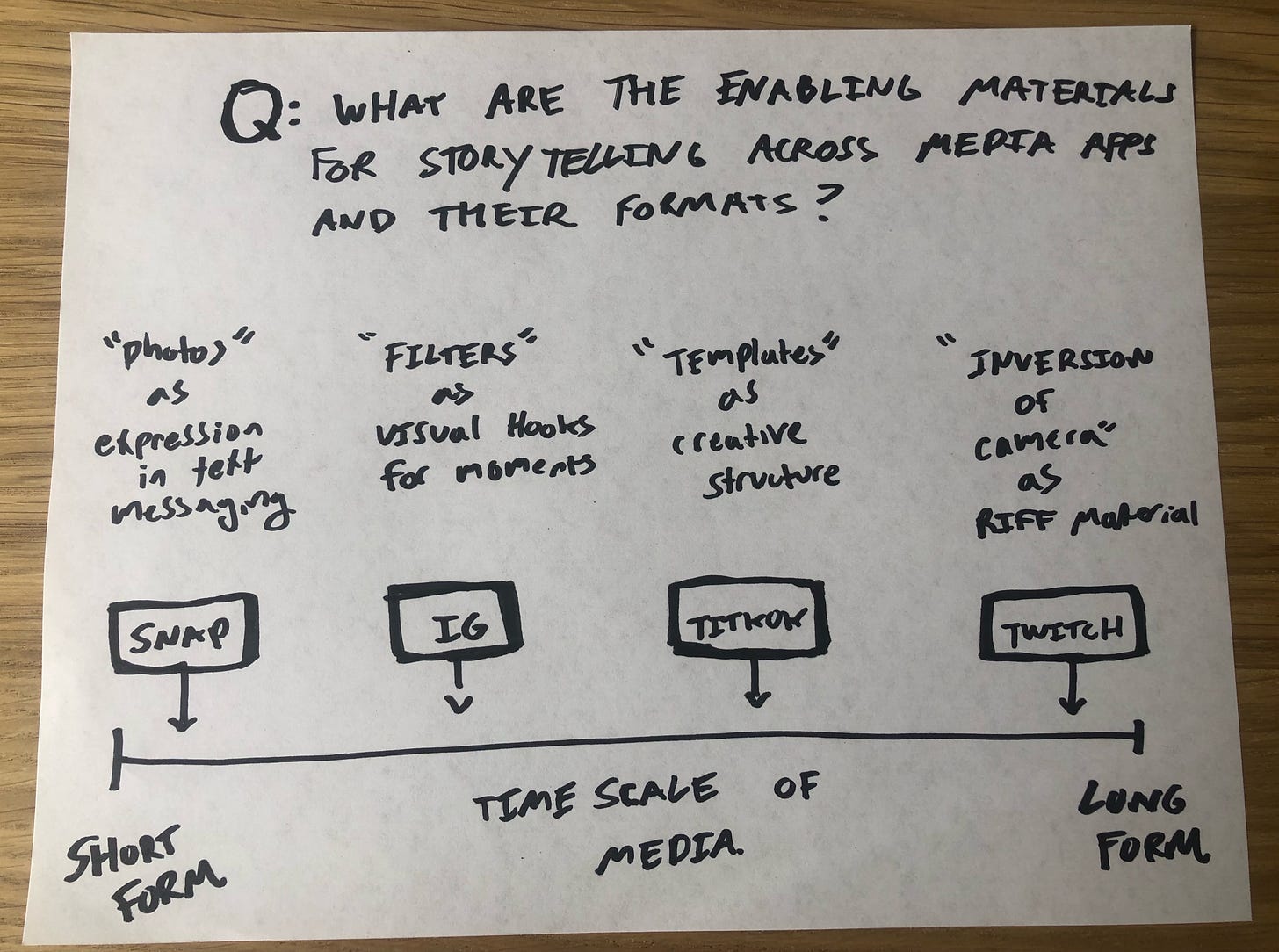
For example, let's look at some of the major visual media platforms today. If we break them down on a time scale from shortest to longest form — and then within each, point towards how they have designed the product with constraints and provided creators with source material to create "their" distinct format.
Snap
A text messaging app that adds expression, emotion, and nuance to each message through a background photo. Adding a photo allowed the same text to have a variety of meanings with a change to the background photo. This is a source material that took a normal boring text to a whole new level. Meanwhile, ephemerality was a constraint that unlocked more sharing because the photo now has less gravity and repercussions. There are a few more subtle constraints and many more use cases but you get the point.
IG
A photo album for your life where it uses filters to make each moment stand out. It uses filters to make the entry point into a subsequent story bigger and more welcoming. Filters are the source material that enabled anyone to produce a more compelling album cover. They’re a gateway drug to the rest of the story. They build constraints by designing the share UX to go through this reality altering process every time where they only gave you a few different filters to play with.
TikTok
An entertainment marketplace for short-form videos. It doesn’t concern itself with any of the social aspects of sharing with friends. It is a ruthless space in which it weeds out the weak and promotes the best, wackiest, and most engaging videos. TikTok has like ten components that you could consider source material from audio, duets, and #fyp. It’s created a fascinating interplay between a variety of integrated tools to create and the feed that creates an education playground to source inspiration from.
Twitch
Watch people do what they do best but in reality we’re here to hangout and meet friends. Twitch gives the party host the burden of entertainment but to make that easier they provide the source material in games. Twitch inverts the camera into streamers’ computers turning the focal point away from the host to a point of common interest in game streaming. This provides a sort of riff material for the creator to layer their personality on top of. It provides moments of spontaneity that create reaction and a feeling of collectiveness.
Closing
I think if you're working on some form of consumer media product ask yourself what kind of storytelling or communication you are looking to unlock? Play with a variety of constraints and see what behaviors it unlocks or incentivizes. Add different source material components across the creation cycle to see how it changes things like propensity to create, speed of creation, and style of creation.
It’s easy in hindsight to identify them for established platforms, but these formats in their composition are some weird alchemy of all the above. I think you can start to see it early on and when it’s right it becomes some version of increased capability, creativity, and confidence to share that’s really special. It’s a real artistic process with feedback loops that make the pursuit so fun to chase.
If you're building or investing in these kinds of products, or have any thoughts on some of the ideas here, i'd love to chat @sorenwrenn. Also, if you have if you have any friends that might like this post — hit the viral button right below.


